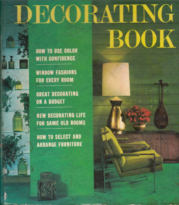
These are some of my favorite images from the book, though there were LOTS more that I loved bits and pieces from. These just looked the most current to me.
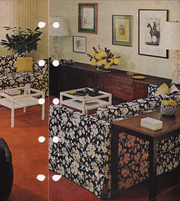
Check out that fabric! Looks straight out of the Quadrille showroom!
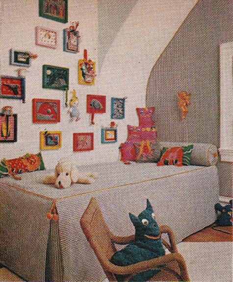
How adorable is this kids room? The gallery wall is cute and casual. I love how the wallpaper and bedding match (looks like a small ticking stripe with an orange trim border)
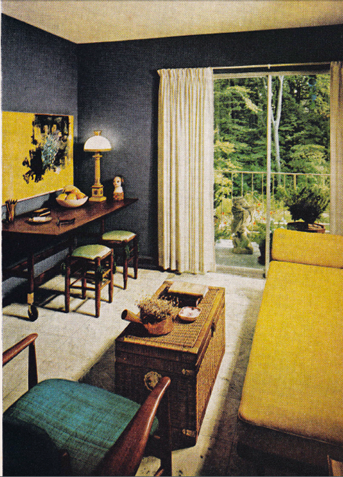
Look at those gorgeous dark walls! (wish they would have done the ceiling too though). The white drapes keep things fresh (but they should be a couple inches longer I think). Love the desk on casters with the little green benches. And I'll always love campaigner wicker furniture.
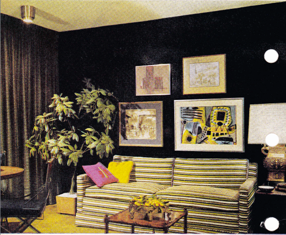
More dark walls. Look at the horizontal stripes on that sofa! So cool. I love the art and the big potted tree. Doesn't this look like a Ruthie Sommers room?
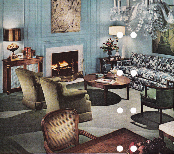
Except for those horrible olive club chairs, this room looks like it could be in Elle Decor. I love the blue walls with all that amazing paneling!!
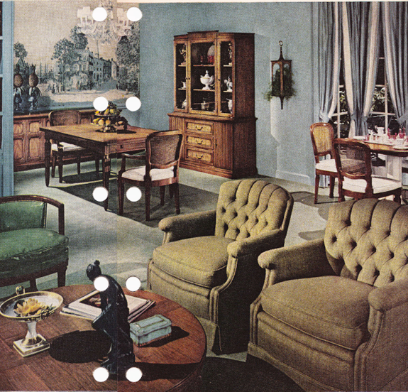
Here's that same room from another angle. I'm all about wall murals lately, so this shot gets me giddy. (stay tuned for an upcoming client project involving scenic wallpaper!!). -- Also, love the trimmed out curtains here and the bronze statue on the coffee table. Not loving that weird plant wall thing, the matchy-matchy furniture sets (and those chairs again. yuck! among other things, the scale is really off)
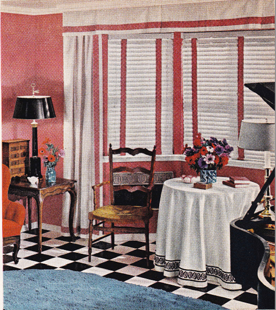
Take away the blue shag, and this could be a Mary McDonald room. (PS are you watching Million Dollar Decorators?! Yikes!!)
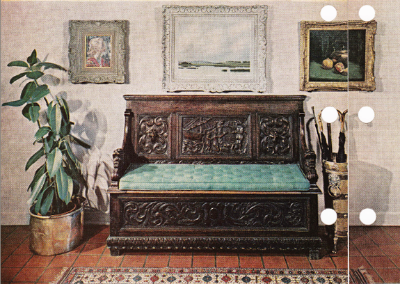
This entry feels so California to me! I like the mix of ethnic style with those more trad art pieces. The tufting on the bench cushion is lovely and I really want that brass planter!
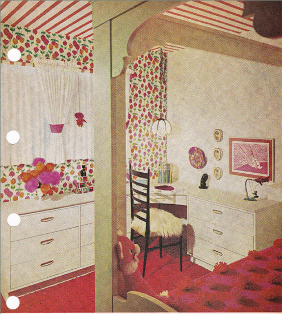
Stripes on the ceiling, floral on the walls! So very Kate Spade! I like the green color on the canopy bed, but the pom pom bedspread needs to go. How do you even sit on that comfortably?
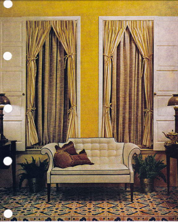
My heart stopped when I saw this little settee. It's perfect in every way! Also love the wall color, the floor tile and even the drapes! Cute with the double tie-backs!
What do you think? Kind of crazy (a little disappointing maybe?) how much we reuse design ideas over and over again!
I am pretty blown away at how identical a lot of the design elements are to what we see today. I would expect there to be a clear relationship to the past but with lots of updates to shape/color/style/fabric patterns. But some of those pictures could be reprinted and passed off as current...(maybe more of the furniture would have to be painted! ha) Let's just hope we never see this happen with some of the very 90s decorating books I see at used bookstores all the time! Yikes.
ReplyDeleteThat was a great find and so fascinating! Thanks for sharing, I am going to have to come back and look again! Cindy
ReplyDeleteThat was a great find and so fascinating! Thanks for sharing, I am going to have to come back and look again! Cindy
ReplyDeleteThere are no new ideas under the sun-- I bet if you could shoot those rooms digitally, you really couldn't tell that they were old. But if orange shag carpeting ever comes back in I'm going to eat my words.
ReplyDeleteWhat a great find! I am going to pay more attention to the books in our thrift stores now! So fun and yes that seatee is my fave! oh and the kids room with the ticking...love it all! ...-Ann
ReplyDeleteGreat post and catch!! I totally agree w/Em--some of those pictures could be passed off as current by high end designers--and BH&G was never considered high end in terms of design, even in their special interest publications, but very middle America--I wonder what House & Garden and House Beautiful looked like then--it's funny, but also a little sad how tired and uninspired the industry can be.
ReplyDeleteGreat post! I think it's neat we reuse design! Thanks for sharing your opinions! I can't wait to find some vintage decor mags myself now!
ReplyDeleteI love these pictures! It's funny, but now that I'm decorating my first "grown-up" house, I find myself drawn to the colors and styles of the 70s. It's not just that this stuff is style again, it's that those are the colors and styles from my childhood, and I think subconsciously I associate them with home.
ReplyDeleteWow, with better photography I would totally think some of those rooms were done recently. I like looking back at the old stuff, it helps you see what trends and looks have staying power.
ReplyDeleteLove the throwback Jenny! Great lines and contrast will never go out of style, which I find comforting not disappointing. Spend your $$ on a few beautiful items and your room will stand the test of time. Also, I think the pics do demonstrate a more mature approach to color these days - not as saturated or inundated with louds "pops." [Although 1968 -Vietnam, MLK's shooting, the 60's in general - would make me need some neon yellow too!]
ReplyDeleteErin
So much fun! These pictures are really interesting. Thanks for the trip back in time.
ReplyDeleteIt's all recycled stuff! Great find though. Very interesting.
ReplyDeleteI'm so obsessed with this post, Jenny. There aren't enough words.
ReplyDeletexoxo
Kelly
These are amazing photos!!! Thanks for scanning and sharing!
ReplyDeleteLOVE your blog!!!!
Good design lasts through the ages: invest in it! That is the lesson I am learning here.
ReplyDeleteYes, this does prove that there really are no new ideas, just new takes on old ones. It was fun looking through these pictures and seeing so many familiar styles!
ReplyDeleteOhh I love old decorating books too!!!
ReplyDeleteI love these old H&G books! I found one from 1981 at a vintage shop down the street. It has some amazing rooms:
ReplyDeletehttp://smallshopstudio.com/2011/01/25/bitchin-addition-1980s-interiors-book/
I think its reassuring when we see design elements being repeated over time. I often am convincing clients that purchasing well designed quality items that cost more than your average Bob's furniture will be well worth it in the long run. These types of pieces can easily be passed onto kids and grandkids and last the test of time. I think its better to live with a few quality things rather than a house full of mediocre furniture that may only last 5 yrs.
ReplyDeleteI love seeing how similar the styles are again! Very cool find!
www.ChristiaMarieInteriors.com
Easily the favorite post I've read this week. Love it, Jenny! The images and commentary are both perfection.
ReplyDeleteI've amassed quite the collection myself. I agree, it's so fun to look back and see how many trends I'd happily use in my home today. It's equally funny to see just how bad bad design can be sometimes :)
ReplyDeletewha???? what a great find!
ReplyDeleteI've bought a few old design books for thrift stores too. One Laura Ashley one has a ton of classic tutorials in the back and has a pattered cover that is a current wallpaper pattern. I think they are fun to pick and choose from them.
ReplyDeleteWow, it is crazy how style is recycled over and over. Kind of fun, kind of disappointing. But I guess if something works so well then it's bound to either stick around or resurface in a new-ish kind of way. Fun post!
ReplyDeleteI'm kind of a lurker here (sorry!) but I felt compelled to comment because it's such a facinating discussion. I think it's a bit sad - not because we are recycling ideas but because there may come a time, not long from now, when we will look back on our homes and scowl because they no longer look 'current' and feel the need to replace it all. My home growing up didn't look too different from these pictures - indeed, I think back now and realise how AMAZING some of the things my mom chose when I was a kid - but then the 80's and 90's hit, she got rid of loads of it because it looked too old fashioned at the time. Now, we look at it and go, 'such timeless style!' but is it, when trends fall out of style every 10 years? I could guarantee you that the majority of people would have thought this was awful 15 years ago even though we all love it now. Maybe we should have hung on to all the stuff we now see as awful from the 80's and 90's because in the next 10 years we will be wishing we hadn't ;) Anyway, just wanted to put my 2 cents in! Brilliant post though and I - just like everyone else - see so many great things! I just wonder if I would have 15 years ago? Or 10 years from now?
ReplyDeleteMy parents built our house in 1968 and these pics bring back alot of memories! Thanks for posting :)
ReplyDeleteWWWWWWWWWWWOOOOOOOWWWWWWWWWW!
ReplyDeleteThat's awesome. What a great artifact! Some of these rooms look like they could have been decorated by an ancestor of Jonathan Adler's! :)
Happy Wednesday to you and your crew!
Hilary
I have a bunch of vintage design books and get a kick out of all the repeats! Nothing new under the sun, as they say.
ReplyDeleteI think they all look like high end lovely, decorating back in 1968 and many things remind me of the house i grew up in which I will love forever regardless of my taste now. I am sure we would have thought these rooms were fabulous if we were back in the 60s. Also their was no "instant" way to see something. You waited for the monthly magazine
ReplyDeleteCat
I have to say, having lived through the 60's and 70's, some of this stuff still makes me shudder, even if some elements are objectively lovely; too many bad design associations.
ReplyDeleteThat said, almost all designs will continue to recycle until mankind leaves the planet, it's just our nature. What is old and stale to older people is fresh and new to the next generation or two to come along.
I remember working at a very high end/trade only antique shop where there was a pair of lion head sconces that illustrated that point. The lion's head was such that it could have been easily mistaken for an ancient Assyrian relic, or a piece modeled in the Art Deco period, in the manner of the Palais de Chaillot in Paris, when what the sconces actually hailed from was the early Napoleonic era.
Everything old is new again at some point...
love that settee
ReplyDeleteI may have to get this book! If it weren't for the few things you mentioned I could think these rooms were from today! The first picture with the black and white sofas is my favorite!
ReplyDeleteI love old decorating books. My grandmother has a bunch from the 1960's, and the rooms (except the kitchens) could TOTALLY pass for current designs. Think lucite, faux bamboo, etc. Just goes to show that there is nothing new!
ReplyDeleteI thought of this post while I was watching the new X-Files: First Class film. It takes place in the sixties and the interior decorating in the mansion was beautiful! Was it modern or true to the times? Hard to tell these days!
ReplyDeleteThere are my favourite Milo Baughman chairs right on the front cover. I'm trying to find a vintage pair here in Canada without much success. I've saved a spot in my family room and my IDs have already pulled fabric samples for reupholstery. Love them, need them...
ReplyDeleteWonderful post!
I must say I like the pompom quilt...quite an unexpected texture.
ReplyDeleteIt's a pleasure to see how beauty can transcend generations...
FYI, I just read that pom-poms where originally hair accessories, and were named for Mme. de Pompadour, who popularized them. See the book, Paris Life & Luxury in the Eighteenth Century, by Charissa Bremer-David A bound catalogue and essays to a show at the Getty Museum.
ReplyDeleteI'm sure you've seen this, but http://www.designsponge.com/2011/06/before-after-kate-spade-inspired-childs-room.html and http://brightbazaar.blogspot.com/2011/02/three-bold-and-beautiful-living-rooms.html are uncannily similar to the pictures you posted!
ReplyDeletefunny how the photography is the most dated thing about some of the rooms!
ReplyDelete