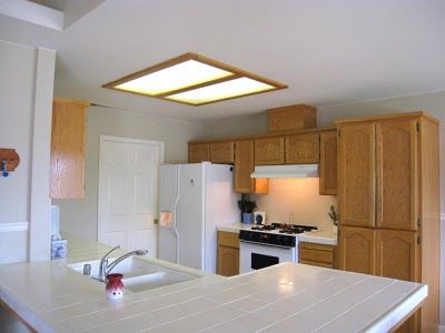
My parents used to have a fluorescent light box in their kitchen that looked a lot like this one


(image from google)
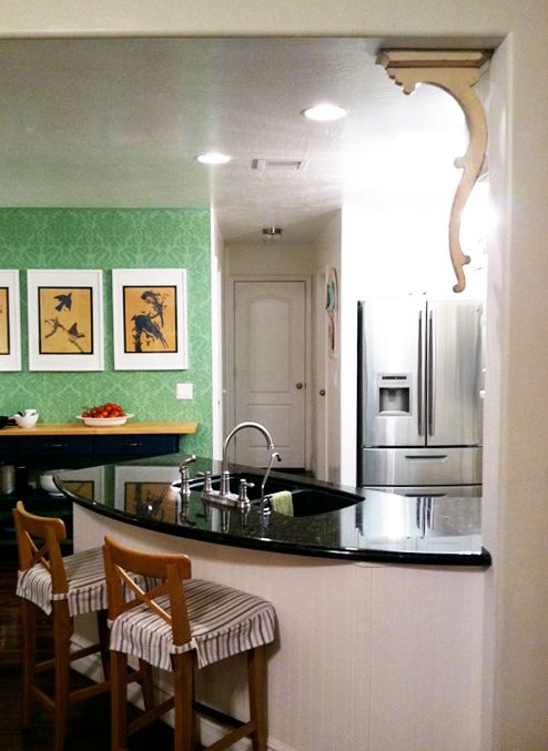
But my clever and handy mom and dad pulled down the box, moved the fluorescent bulbs to the perimeter of the inset box, added some crown moulding to mask the long bulbs, and hung a chandelier in the old wiring in the center.

It's nice and bright (which is great since there are no windows in my parents' kitchen), and it makes the room feel taller without the drop.


PS Today on Babble I'm talking about our vacuum cleaner situation, present and future. Input is kindly requested!
absolutely genius! and it definitely looks so much brighter now.
ReplyDeleteI have a similar situation in my kitchen. I love this idea, but it's a little hard to see. Could you possibly post a photo from the same perspective as the "before"? Also, I hope to see some other ideas in the comments section - maybe with links to other blogs with pictures! Comment away, please!!
ReplyDeleteWhen I moved into my current home, my kitchen already had that exact same situation with the molding and the hole in the center with a fan hanging from it and I always wondered how it got that way. Now I see! lol
ReplyDeleteWhat a terrific way to tackle the 80s flourescent lightbox! Love it! Thanks for sharing.
ReplyDeleteClearly design runs in the family! :). That's brilliant and gorgeous.
ReplyDeleteWhat a great before and after! This is such a great feature in the space- I must say, I also LOVE the wood floors in her home... gorgeous! Thanks for sharing!
ReplyDeleteabodelove.blogspot.com
These old light fixtures that are prevalent in so many older homes drive me crazy! Thank you for posting a wonderful and quite lovely solution! My problem is that I had tube flourescent lighting in the soffit under plastic grids...remember those?! You might be too young.
ReplyDeleteFabulous addition! It looks beautiful! Great kitchen, as well.
ReplyDeletewww.sadieandstella.blogspot.com
So clever...great little makeover!
ReplyDeleteAny ideas on the hardwood floors that are in your parents' home? They are beautiful! We are hoping to redo ours in the near future. Thank you in advance!
ReplyDeleteWow that's awesome! I can't believe they don't have windows in their kitchen - I thought that was a law or something. :) It's stunning even without them though!
ReplyDeletelove me a good vacuum cleaner...definitely consider electrolux. my obsessively clean texan mother swears by them.
ReplyDeletelove me a good vacuum cleaner...definitely consider electrolux. my obsessively clean texan mother swears by them.
ReplyDeletelove me a good vacuum cleaner...definitely consider electrolux. my obsessively clean texan mother swears by them.
ReplyDeleteI love your parents kitchen! What a great idea.
ReplyDeleteOh, now that is just GORGEOUS.
ReplyDeleteGenius. I love that they didn't throw away the existing bulbs. Great upgrade!
ReplyDeleteWhat a cool solution! So much more stylish and efficient.
ReplyDeletehow smart! love it. I really love their flooring, do you have the name/resource to share?
ReplyDeleteThanks!!!! :)
My parents went back and forth a lot about what flooring to go with. They thought about wood and also were considering laminate. They ended up going with a peel and stick! Each of the 'planks' is like a linoleum tile. It looks perfect after years of use (grandkids and dogs!)
ReplyDeleteI'll ask my parents were they bought it, but I think it was just Home Depot? Maybe Lumber Liquidators?
We did the same thing in our kitchen.
ReplyDeleteIt really opens up the space and plays up the height of the kitchen which is small.
The previous owners had a ceiling fan in the kitchen. Yuck!
genius! i see where you get it from!
ReplyDeleteOne word: WOW
ReplyDelete--Courtney
Great idea for the 80"s style kitchens which were famous for these inserts.
ReplyDeleteI was perusing the site yesterday,good info espescially on upholstering tips..
LMF.
What a cool idea! If we get to move sometime, I won't write off these types of kitchens!
ReplyDeletethis is so cool! love it!
ReplyDeletelove, rach.
www.so--hi.blogspot.com
Hey, you stated in a much more direct way what I was trying to communicate, thanks, I will recommend your site to my friends.
ReplyDeleteMy blog:
rachat credit pret www.rachatdecredit.net
Wow.. Stunning creation and great upgrade! :)
ReplyDeletegreat idea to outline the old light behind a molding box. Very clever and a great solution - I wanted to not lose so much light by just having one center light in a somewhat dark kitchen, so this is a great compromise. My ceilings are lower too so this help lighten it up. Consider the idea stolen - thanks Jenny!
ReplyDeleteI really dig their chandelier. Can you share the source?
ReplyDeleteLove it! I just did a post 'kitchen bitchin' about that exact kind of lighting I have in my kitchen, ugh
ReplyDelete(seriously, outside an office full of cubicles, who ever thought this was attractive enough to put in the home?)....
The one redeeming thing about this light is that there is a recessed ceiling under it all...and I can't wait to add molding and some recessed lighting! I also want to paint the ceiling...
great post. Love your blog!
The chandelier looks perfect for the spot. It does make a big difference for the area.
ReplyDelete