
Being a graphic designer is a blessing when it comes to creating a look on paper, but translating our style into home decor proved to be, well, challenging.
So when I stumbled across Lauren Liess from Pure Style Home, I knew I wanted her to help me. With a brief over-the-phone consultation, she was able to give me direction on the larger paralyzing decisions...like "Buy something modern for the second buffet," or "Fill this wall to the ceiling with art." She's a genius!
I then spent the next ten months collecting furniture and art (Lauren also helped us with our master bedroom) and putting the pieces together to create a look that truly reflected our style. My husband is traditional and I like a bit of quirk. Voila!
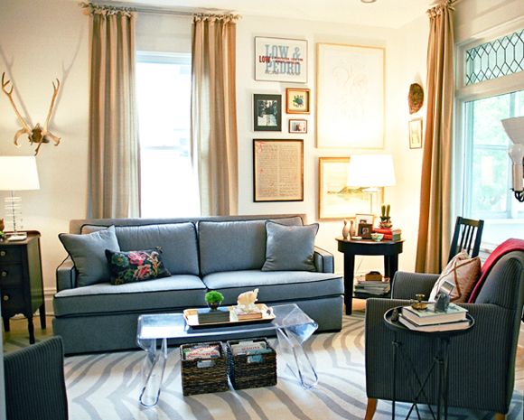
When we started this transformation, many of the larger items were in place, but the rooms felt unfinished and off balance. Lauren's advice to create symmetry (around the picture window and couch) and filling the space with 'pretties' proved to be the key to making it feel cozy and inviting.
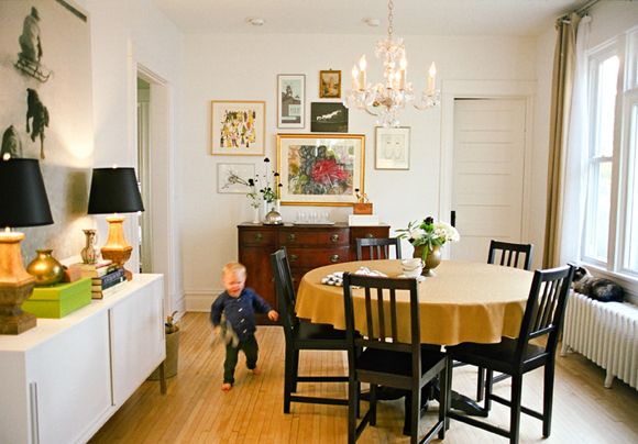
My husband was afraid that filling the walls with art would make the space feel smaller, but in fact your eye is now drawn up and around the rooms, creating the illusion of more space.
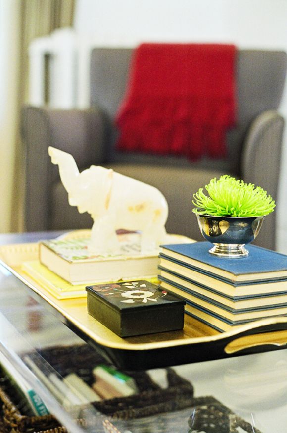
And adopting the mindset that 'it might get broken, but it's worth having out and not hidden for the next ten years' helped with creating table tops suitable for a toddler (we have since moved the cactus-ha!). As long as we have a few things out that our two year old son can touch, he is happy to leave the breakables alone.
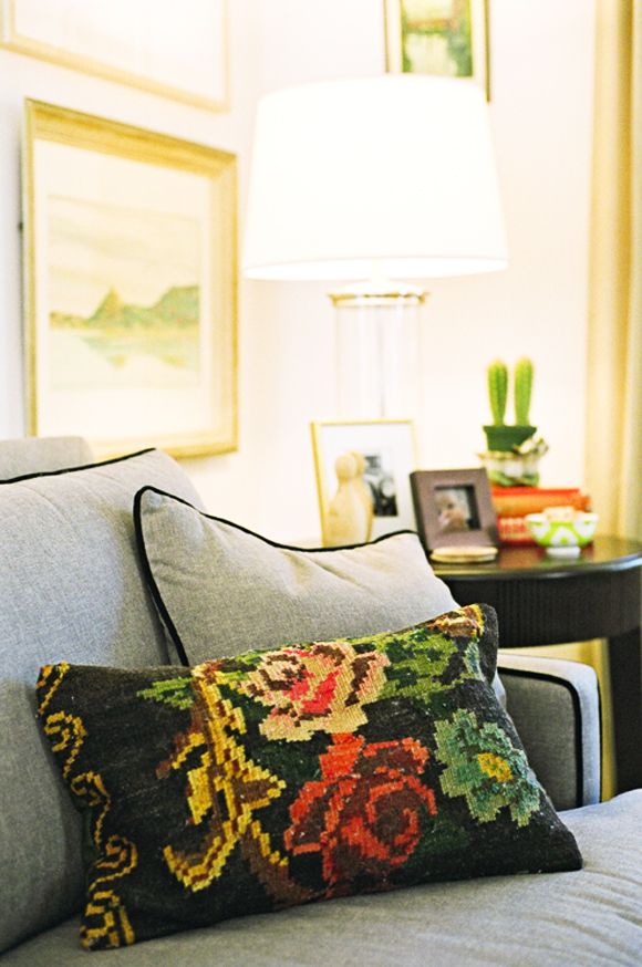
Another key piece to pulling things together was a color 'theme'. I wanted the rooms to connect, but I didn't want to be matchy-matchy. The pillow on the sofa (which I just LOVE) was a gift from missionary friends in Bosnia and it became my 'go to' when I was tempted to purchase something. If it didn't jive with the pillow ... I had to pass.
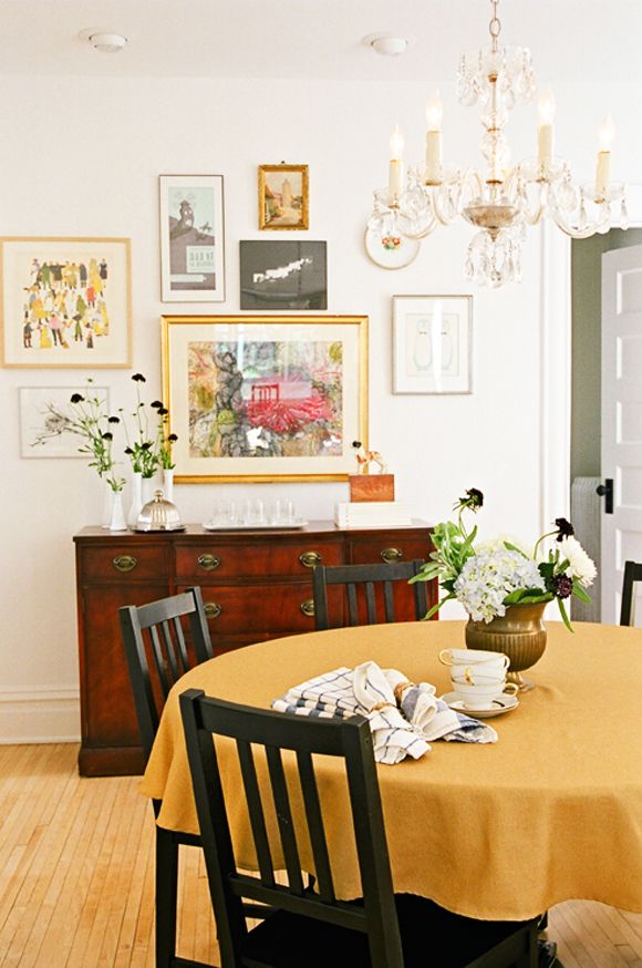
The conversation starter in the room is definitely the large black and white image in the dining room. It's an image of my dad as a boy and we just love it! I sat for months on the couch wondering what do with that space and now having it filled with a little piece of family history is a treat.
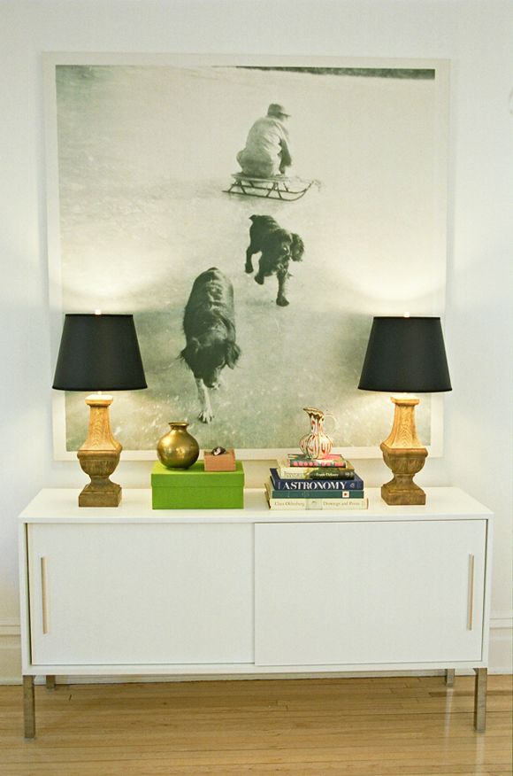
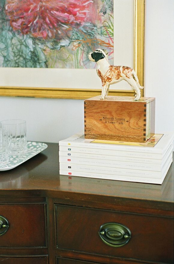
In fact, if you look around, animals play a theme in most of the vignettes. A happy accident I guess, but we love the subtle 'lodge' feel.
Well, there you have it. Our living and dining rooms. Thanks for looking!
I will list sources below.
All images by amymajorsphotography.com
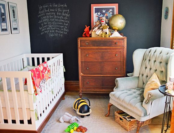
P.S. I added a photo of our nursery here too. It was finished when I spoke with Lauren and I told her 'THIS is our style'. Amazing how nesting will kick you into gear to get a nursery ready while the rest of the house sits undone. :)
Resources:
Sofa - Ethan Allen
Rug - West Elm
Drapery - JCPenny
Club Chairs - Thrifted
Round End Table - Overstock
Campaign Side Table - Urban Outfitters
Three Drawer End Table - Antique
Coffee Table - Overstock
Lamps - Target/JCPenny
Living Room Art - Collected over the years
Sofa Pillow - Bosnian rug turned pillow (gift)
Pink Throws - West Elm
Coffee Table Baskets - Target
Coffee Table Tray - Target
Elephant - Thrifted
Floor Lamp - Antique
Chandelier - Antique
Dining Table - Thrifted
Dining Chairs - Ikea
Wood Buffet - Antique
White Buffet - Ikea
Buffet Lamps - JCPenny base with Target shades
Books - Thrifted
Art - Collected over the years
Large Print - Photo printed at Canvas On Demand
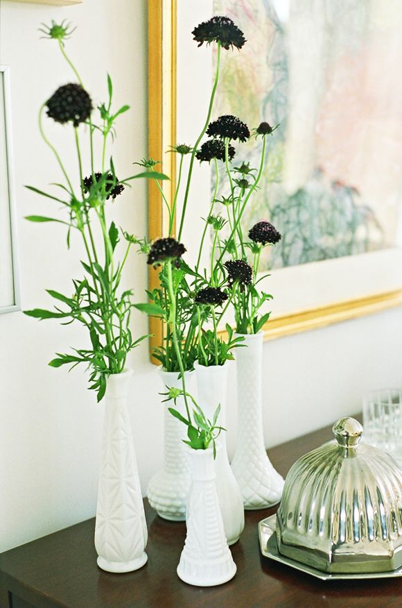
Vases - Thrifted
Dog - Thrifted
Buffet Tray - Target
Bar Glasses - Williams-Sonoma
Silver Cheese Server - Thrifted
Cigar Boxes - Local Cigar Shop
What an AMAZING living room. Looks like it should be in a magazine!
ReplyDeleteTiffany
tiffanyleighinteriordesign.blogspot.com
very lovely! i really like the chandelier in the dining room
ReplyDeleteI like how you have displayed the art so your eye is drawn up and around the walls...as sometimes too many prints on the walls can make the room feel enclosed and 'busy'. I like how the cupboards use sliding doors as this saves space.
ReplyDeleteLove the art collection over the buffet! PERFECT!
ReplyDelete-Trish
love this home and Lauren Liess!
ReplyDeleteOooh, one of my favorites you've featured! The art is fabulous, and that nursery is just great.
ReplyDeleteBehind me sits the exact buffet which was featured here. I inherited it from my grandmother and have it mixed with contemporary items. I'm so happy to see others also have this classic piece of furniture from Drexel.
ReplyDeleteOh my! Her home is stunning! I am completely in love with everything (especially the nursery)!!
ReplyDeleteSUCH a good home tour. Loving it!!!
ReplyDeleteI love this! Love gallery style art. Great feature!
ReplyDeleteJennifer
We just put an offer in on a house that has this exact layout and even many of the same features. Same window positions, leaded glass, radiator positions, etc. so this is amazing inspiration for what the rooms can be. I agree with everyone else, this house is totally magazine worthy. Fantastic work! Now let's see more of that nursery :)
ReplyDeletelove all the framed art layered together and the chalkboard wall in the nursery is adorable!
ReplyDeleteThis comment has been removed by the author.
ReplyDeleteJust lovely. Not a thing about it I didn't like. All the details work so well. I especially like the enlarged photo of her dad. I think I will be stealing that idea.
ReplyDeleteIt looks amazing. You did a wonderful job. Love the gallery wall of art.
ReplyDeleteI love her style! And I love how collected it all feels. They did a great job!
ReplyDeleteThis is a great post. Love Anne's house and all the L.Leiss ( we love her) touches that are evident. Such great gallery walls, that make all the difference. A little old, a little new..it looks so well curated.
ReplyDeletexo Nancy
Powellbrowerhome.com
Lovely room but I would have loved to have seen some "before" pictures.
ReplyDeleteLove this house. Looks lived in and not designed. Especially in love with the tray side tables - trying to find them to buy!
ReplyDeleteGreat pictures, tons of inspiration here! I agree that it looks lovely and cohesive but not overly "designed" and uptight. I feel like my toddlers would still knock over many of the pretty vignettes but even without those, the bones of the design choices/furniture are good enough to keep the room looking well done. Love it.
ReplyDeleteWOW! I pretty much just pinned the entire post
ReplyDeleteIt's absolutely beautiful!
ReplyDeleteI really love this! Did you paint the walls? If so, which color did you use?
ReplyDeleteLovely! We are navigating the "should we put this out even though the kids might destroy it?" also.
ReplyDeleteThe room is stunning! So much inspiration to pull for every style/space -like my basement apartment... Thanks for sharing!
ReplyDeleteLauren's talent is amazing as are these rooms! I especially love the vignette with the oversized photograph - almost makes me want to sort through the boxes of old prints in the attice to find one for our wall. Thanks for sharing these inspirations, Cynthia
ReplyDeleteThis room is my very favorite tour to date. It is just beautiful. I love that it feels lived in and personal rather than just "decorated." I would love, love, love to see more of Anne's home.
ReplyDeleteWOW. It's beautiful
ReplyDeleteAnne's home just begs for guests. And I'm grateful to be one of them from time to time. Her home reflects her love for hospitality. I especially love the adorable little boy running through the pictures.
ReplyDeleteI'm back to pin a bunch of these photos! Couldn't get this room out of my mind all day!
ReplyDeleteTiffany
tiffanyleighinteriordesign.blogspot.com
It's a beautiful place for beautiful people! I think it points to our Creator in lots of different ways. It's a slice of heaven on 22nd Ave. -Erica
ReplyDeleteI'm a big Pure Style Home fan so this post was really interesting. Love the large print with the dogs over the buffet! Great job.
ReplyDeletePlease please please, what is the gorgous white paint color? Amazing tour. And the nursery is lovely as well. Great Job!
ReplyDeleteI immediately thought of Lauren upon viewing the first image but I still didn't get that she was the Lauren who e-designed it until Anne explicitly said so. I am a huge fan of Pure Style and Lauren's intuitive approach to design. Her spaces all share a certain quality / aura and yet they are all so individual. Loved this little tour - hope to see more. Master bedroom by Lauren?
ReplyDeleteLove the tour - Great work Lauren and Anne!
ReplyDeleteWhat a beautiful space! Really relaxed and inviting, yet very polished, too. Thanks for the inspiration!
ReplyDeleteI love the idea of the large vintage family photo over the buffet. This is a great idea to fill up a large space with something that's not too cheesy and doesn't cost a fortune.
ReplyDeleteThanks everyone! I'm humbled by all of your comments. Since a few of you have asked...the paint color is Benjamin Moore Decorators White...the perfect white in my opinion.
ReplyDeleteAnne G
The living room space is really special and lovely but that nursery! Oh how I love it!
ReplyDeleteThis is seriously my most favorite series in blog land!! Amazing spaces and resources!!! I look forward to it and bookmark everyone of them!!
ReplyDeleteLove this soulful little spot! Lauren and the owner were perfect together...think I need to call Lauren!
ReplyDeleteAnd the nursery...LOVE!
I so love this series!! Thanks for sharing another great space. And that couch is perfectly lovely.
ReplyDeleteAbsolutely beautiful space! I love the incorporation of quirky and traditional. Bravo!!
ReplyDeleteThanks for sharing this lovely home. I really liked the 'lodge feel' of the dog ceramic (?). At least it wasn't painted all-over white + left as is.
ReplyDeleteLovely. Lauren is incredibly talented.
ReplyDeleteThank you for all the wonderful pictures! We bought at the start of the year a "new old house"! It's very old fashioned, still set in the 60's! I want to keep some of the look but really get rid of the horrible old wallpaper! We want a modernized rustic look, if there's such a thing! You're pictures inspired me to not hold back on the decorating, it's what really brings a room together!
ReplyDeleteGorgeous gorgeous. loving it!
ReplyDeleteGorgeous, well done! One of my favorite homes I've seen in a long long time.
ReplyDeleteWould love to know what kind of flowers those are,
ReplyDeletethanks,
Emily
Love this house! Would also love it if you could share the sources for the nursery! Thanks!
ReplyDeleteReally lovely; great job! Thanks for sharing, especially all of the sources. Enjoy it!
ReplyDeleteIs the large photo printed on canvas? How is that mounted, hung? It looks really, really super.
ReplyDeleteOBSESSSSSEEDDDDDDDDD. traditional quirky is definitely my favorite style around.
ReplyDeleteFab! I absolutely love it. My partner and I struggle to merge our traditional/eclectic styles too so this is the perfect source of inspiration for me. Thank you for sharing!x
ReplyDeletethat is such an adorable nursery room! love the chalk board idea!
ReplyDeleteBeautiful, top to bottom! I'm also wondering how that large photo is printed/framed/mounted.
ReplyDeletethanks!
SWOON! I love love love that house (apartment?). It looks amazing - cheerful, polished, spot on! Thanks for sharing. :)
ReplyDeleteHi.........great job and I love the nursery too! While perusing JCP window coverings, I was wondering which
ReplyDeletecolor and top style you choose?
Love the print of your Dad.
I find it very interesting. I guess many readers will love to read this one. I hope to see more articles from you.
ReplyDeleteHello all! Thanks again for your comments. Below are answers to some of your specific questions.
ReplyDelete@Holiday
The campaign tables (I think those are what you are referring to) are from Urban Outfitters. I love them so much, I have four...one in the living room, one in the nursery and two more in the guest room (in brass).
@kh
The wall color is Benjamin Moore Decorators White. My go to white!
@Emily
I'm not completely sure on the flowers (just something I picked up at my local market, but maybe it is a pincushion flower?)
@Koren
The nursery sources are as follows:
Crib - Walmart Baby Mod Olivia 3 in 1
Dresser - Craigslist
Tufted Chair - Craigslist
Side table - Urban Outfitters
Globe - Thrifted
Art - Collected (I have a lot of art from over the years)
Stuffed animals/toys - gifts (email me if you want specifics on those)
@Art Wall Katie
@e
The canvas of my dad was printed at Canvas On Demand. They did an EXCELLENT job and were very helpful and assuring. I had the photo professionally scanned at high resolution and they took if from there. This specific job is their 1.5" gallery wrap at 55" square. And they have a GREAT guarantee. Helpful for me to pull the trigger on such a large piece. As for mounting, they included mounting hardware, so it was easy to hang. Hope that helps.
@Anonymous
As for the JCP window treatments, I don't have any specifics anymore (I have had them for about six years). One helpful piece is that they are pole curtains, but I pinched them from the back side near the top (with LOTS of rings) to make them look like french pleats...which were too expensive for us at the time.
Hope this all helps! Anne
For curtains you'd better go for http://www.dekornation.com/curtains-and-cushions-drapery-linen/curtains.html
ReplyDeleteI am trying to re-create the 'squiggly' piece of art hanging to the right behind the sofa as I pause to type this question....mine doesn't look quite so cool. Can you give a resource for that piece of art?
ReplyDeleteI love everything about these rooms!
ReplyDeleteAnne, if you are still reading this, would you mind telling me the diameter of your dining table? I would love to be able to fit five chairs around a round table, but I am not sure if I can do that with the 48" that we currently have. Those smaller sized IKEA chairs might be just what we need. Also, if you don't mind me asking, what are the dimensions of the two rooms? They look so similar to my living room/dining room and I am looking for room arrangement ideas. Thank for sharing your story!
@Debora
ReplyDeleteSorry for the delay...we added a new family member (baby boy Lewis) to the mix a month ago and we are just getting back into the swing of things.
As for the dimensions...the table is 54" and the rooms are both 12x12.
Hope that helps in your planning and decorating!
Have fun with it.
Anne
Congratulations on the new baby, and thank you for the response!
ReplyDelete