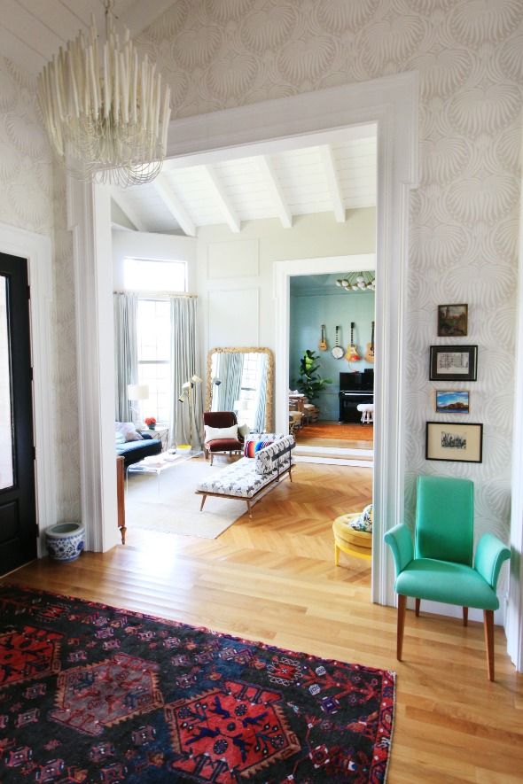
I think the paper works so well with the new chandelier we recently hung in the entry. It's the Tilda chandelier from Arteriors and it was a total splurge, even with my designer's discount, but the Lotus paper was just begging for something special I think. :)
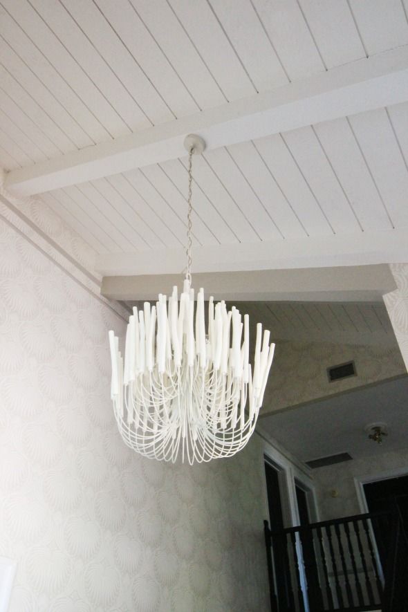
I wanted a really unique chandelier in here, and this one definitely fit the bill! It has that same trad-meets-mod quality. There are five or six bulbs in the fixture, so it's not crazy bright, but it puts out a really pretty glow in the evenings when we have it on. I love it.
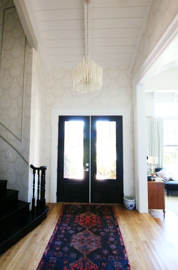
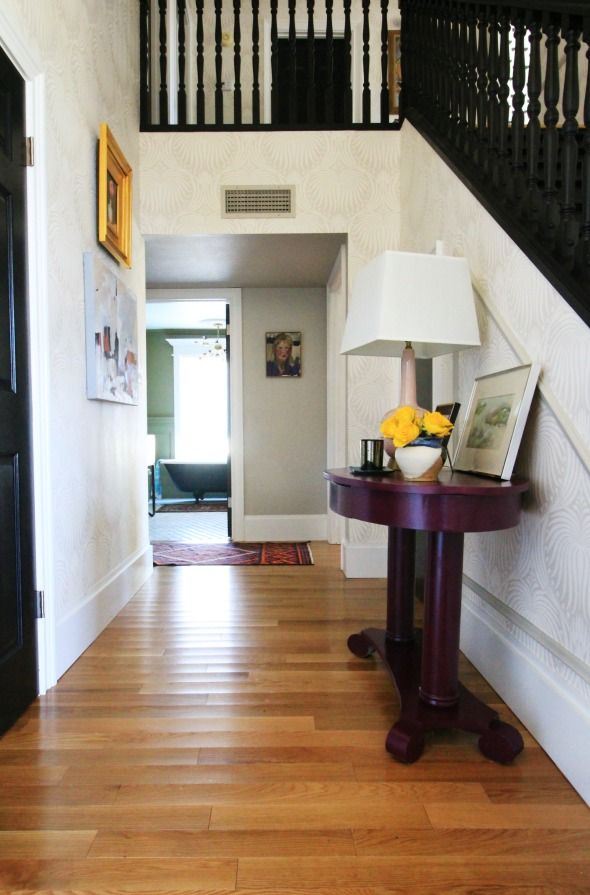
I'm still loving the black stairs, but I think it's about time to get going on the stair runner project, especially now that the paper is installed. I'll probably do something pretty neutral, like a sisal, to not fight the pattern of the paper and the Persian runner in front of the door.
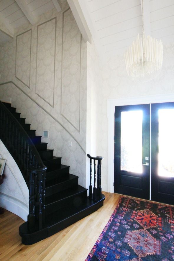
We're getting there! Remember when the entry looked like this?
The entry looks awesome! Love these black stairs and the walls, the rug is so nice too.
ReplyDeleteEnd of tenancy cleaners Surrey
The entry is gorgeous, big impact! And I am so in love with the rug.
ReplyDeleteLove that Farrow & Ball wall paper & colour, it is timeless. A vintage Kalmar Tulipan would look amazing with it. The house is looking amazing.
ReplyDeleteWoah. Your entry is drop dead amazing and that chandelier is heaven. I cannot believe the transformation considering what you were working with.
ReplyDeletehttp://www.fullbellywornsoles.com
Jenny - you've done a very nice job especially the wallpaper! And I adore the wooden console table. My favorite part, though, is the wall molding on the staircase and how it follows the hand-rail down.
ReplyDeletePam
Gorgeous!!!
ReplyDeleteIt looks amazing. Anything F&B is always a home run IMHO. How'd it feel sinking that first nail into it to hang pics? I always hate that and then get right over it. Sorry you're feeling bad...get better soon!
ReplyDeleteI never like wallpaper but this wallpaper is stunning. I love how gorgeous your foyer looks now. The before picture just shows how far you've come.
ReplyDeleteIt is amazing. Another project well done.
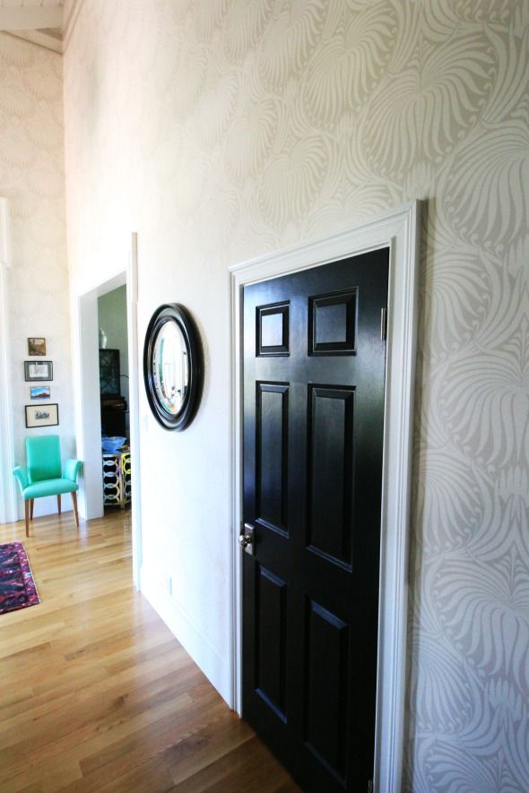
ReplyDeleteLovely, Did you paint the door black??
ReplyDeleteThat chandelier is insane(in a good way)!!!
ReplyDeleteIs that the same console table that used to be blue or green? It looks great in the new warmer color. Is it painted? Almost looks like a dark stain. It's perfect with the paper!
ReplyDeleteThis is all so incredibly beautiful! I'm in LOVE with the black details. So, so lovely!,
ReplyDeleteOH WOW! what awesome amazing entryway!!! great inspiration, thank you!
ReplyDeleteI'm not normally gaga over wallpaper, but this looks amaaaaazing! I love it! I love how it is understated but stunning, traditional yet modern. Perfection. Well done!
ReplyDeleteLooking gorgeous -- I love the subtlety of the wallpaper! amazing job as always!!
ReplyDeletex Lily
whilemyboyfriendsaway.blogspot.com
I thought you were going to write that post without mentioning the light fitting there for a sec. I am in love!! It is stunning. Love the wallpaper too. Of course, it is all gorgeous!
ReplyDeleteBeautiful, Jenny! I love the crispness of the black doors paired with the fresh feel of the paper. And that chandy…so dreamy!
ReplyDeleteI love the wallpaper and the chandelier, but something about the wallpaper and the trim on the wall of the staircase is off. It looks too busy. Otherwise looks good.
ReplyDeleteIt's so wonderful to see the wallpaper in your house, as I've had my eye on the lotus wallpaper for sometime for our powder bath. Well done! The entry is gorgeous!
ReplyDeleteSo pretty! I love all the colours, patterns and textures.
ReplyDeleteGorgeous job! That wallpaper is incredible! I love seeing the before and after pictures. If I could make one request, I'd love to see what the chandelier looks like when it's turned on!
ReplyDeleteGet well soon!
The entry is looking so great! That chandelier is amazing.
ReplyDeleteWhat a transformation! That chandelier is FAB.
ReplyDeleteStellar! Always inspiring.
ReplyDeleteHi Jenny, hope you feel better soon. I really love how the house came together. Would you consider please sharing some night pictures? I'm so curious what the Tilda, and the library lighting looks like in action. Really like the new finish on the oval table, too.
ReplyDeleteSeriously love everything you do!
ReplyDeleteHi Jenny
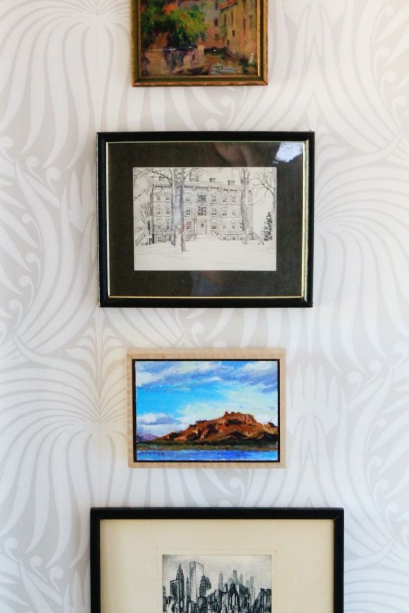
ReplyDeleteEverything is looking so great.You are a master of transformation.In the hallway can you tell me more about the sketch of New York above the green chair; below the seascape?I am pretty sure I have a companion to it.We cant make out the signature and would love to know more about it. Thanks, Karen
I hope you feel better soon.
ReplyDeleteThis foyer is just as amazing as your entire house. I love every inch of it. I was so disappointed in the Domino spread because they didn't do a house tour. I want to see all that goodness. I hope you will do one soon.
You'll pull through! Thinking of you!! Love the entryway! I agree that sisal or something similar would be good. I always find a calming entryway very important as it sets my mood upon walking in. I bet you guys have a large garage where you usually enter, though! Love it!!
ReplyDeleteWhere to begin? I love the pattern on the wallpaper and that amazing chandelier! The colors all flow so well. You are a design wizard!
ReplyDeleteThis entry looks so fabulous - I bet the people that used to live there are so jealous about how amazing the place looks now!
ReplyDeleteI never would have picked that wallpaper off the shelf, but it looks beautiful in your entry! What a great space. Can't wait to see what you decide for a runner.
ReplyDeletewww.stateofsunshineblog.com
Hat's off to your wallpapering professional! That stairwell looks like a seriously challenging task, and it turned out great.
ReplyDeleteThis week I seem to be on a chandelier obsession so I'm loving your new entryway's chandelier!
ReplyDeleteI would love to see it all lit up at night, I'm sure it has a beautiful glow to it. Do you have any photos you could share with us?
We're about ready for a (DIY) stair runner, but I cannot make up my mind - considering a different fabric for each tread and nose (which might be a bit cheaper than covering risers too). I love the sisal look, but I read that it can by slippery. I need to keep researching.
ReplyDelete