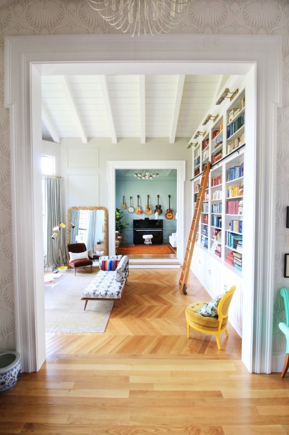
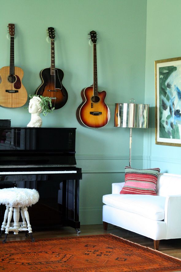
I was lucky enough to get to work with Farrow & Ball on behalf of Domino a couple months ago. They had heard that I was picking a F&B color for my music room (I've already mentioned before that Michael and I had decided against the bright cobalt blue), and they offered to send a color expert over to the house for a color consultation.
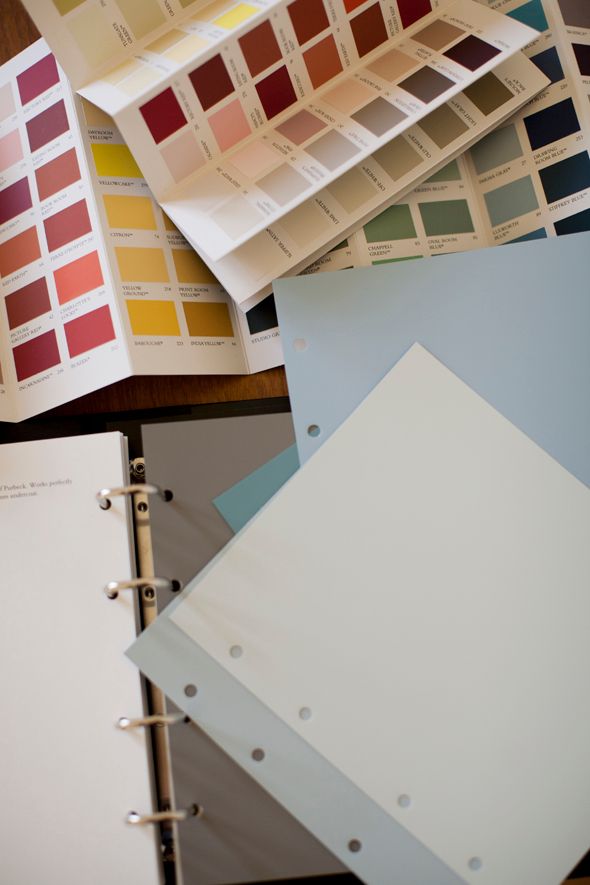
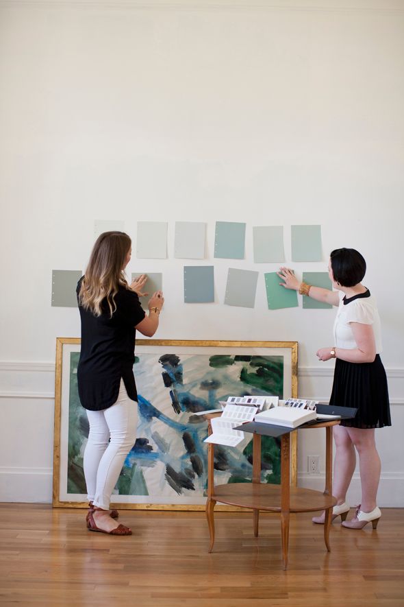

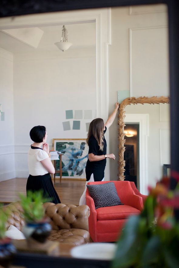
It was SO FUN to meet Amber, who works out of Farrow & Ball's Chicago showroom. Not only was she an all around delightful person, she had the most amazing eye for color and so many insightful thoughts to share. We showed her our home and talked about our decor plans and our color preferences. I had been leaning toward a great color called Green Blue, and after lots of discussion about lighting and room functionality, Amber and I both agreed the color was the right choice for the music room.
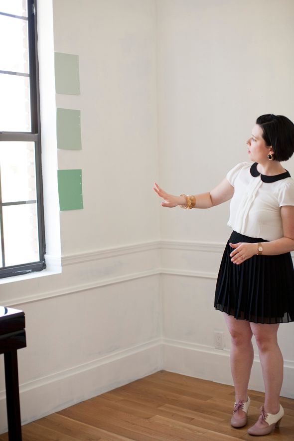
Amber and I loved that the color was sort of a darker version of the green I had ordered for the library curtains.
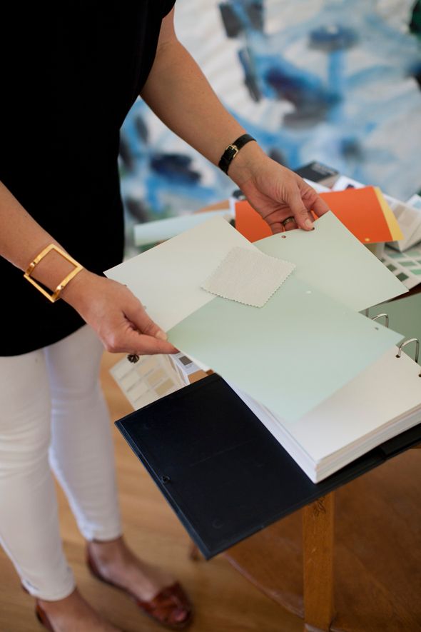
Amber was really drawn to the watercolor abstract I had been planning to hang in the music room and we both thought that the warm, bluey green would compliment the painting really well.
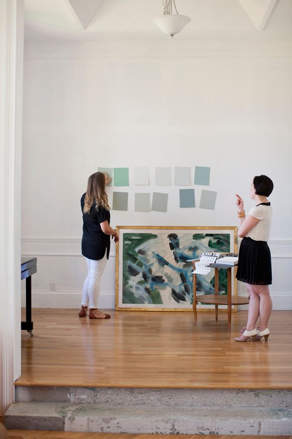
She and I gushed about how pretty the green color pairs with oranges and wood tones. Since I had already purchased the orange over-dyed rug, and I knew I would want to hang Michael's guitars on the wall (more info on these purchases/projects in posts to come!), I couldn't wait to get this color on the walls!
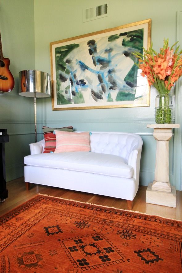
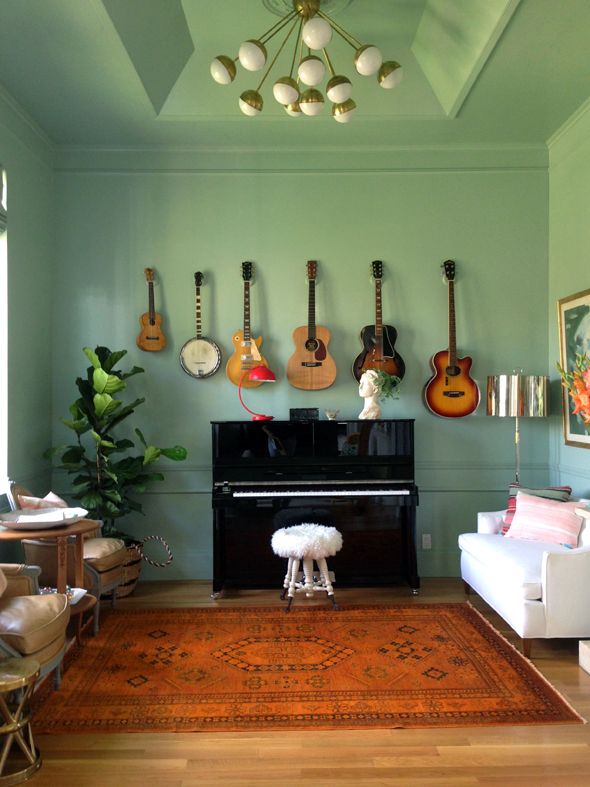
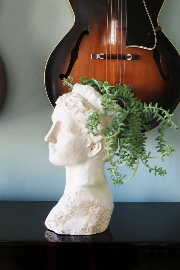
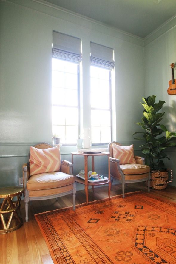
My favorite part of my meeting with Amber was when we were wrapping up the consultation and she threw out a suggestion to wallpaper the entry. I had been so focused on other spaces that I hadn't even really been looking at the entry. She and I agreed that the space was begging for a pretty pattern, so we spent some additional time browsing her samples. Heaven, I tell you!
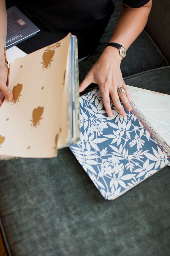
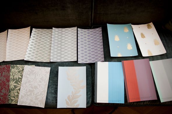
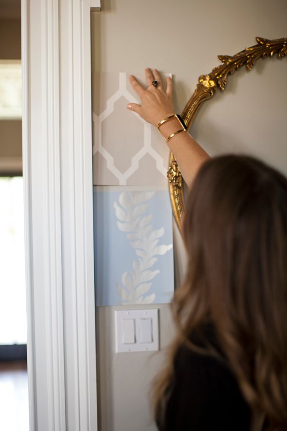

I am such a huge fan of Farrow & Ball colors and paints - it was a pleasure to get to learn more about the company and their beautiful products during this color consultation. I truly couldn't be more happy with how the music room turned out. The color is just what I envisioned - cheerful and soothing all at once. :)
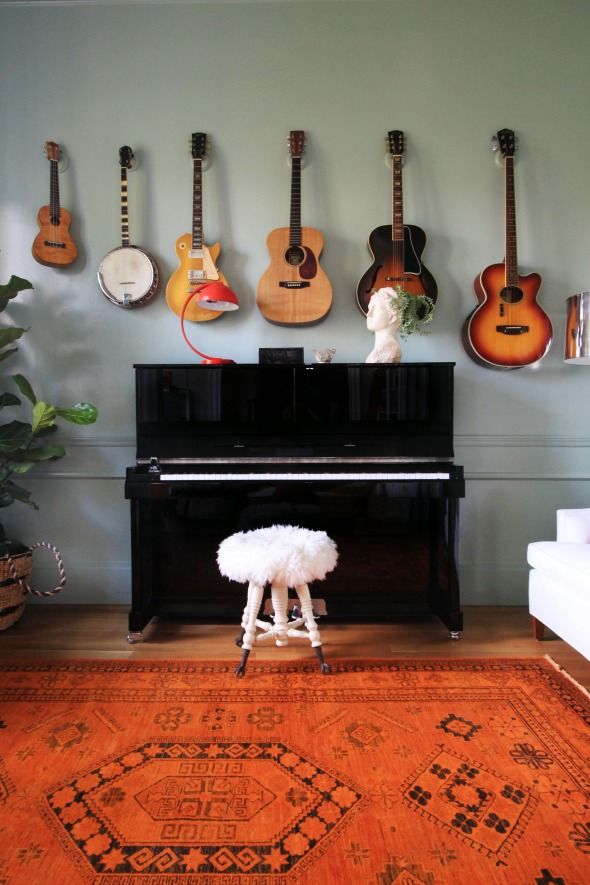
A big thanks to the Domino team for letting me be the Farrow & Ball color consultation guinea pig! It was an amazingly helpful service - I'd recommend it for even the most over-confident of decorators. ;)
And thank you to Stacie Lang for the photos of my visit with Amber!
oh no! the pictures aren't working!
ReplyDeleteAll the photos are not showing up for me, I'm afraid!
ReplyDeleteOh I missed the post about you changing your mind about the lacquered blue! I was looking forward to that!
ReplyDeleteLove it!! Simply perfect with that rug!
ReplyDeleteI really do love the combination of muted wall paint color with the deep orange rug. A great contrast that I wouldn't have imagined, but it looks really right, especially for a music room. Can't wait to see more about the wallpaper in the entry!
ReplyDeleteLaura @ Rather Square
I love the way how your wallpapered entry + library + music room flow together. Such beautiful layers of colors and textures :)
ReplyDeleteYou have no shortage of awesome furniture!
ReplyDeleteJust what I expect from you. This room is breathtakingly beautiful and original. Is the ceiling the same color as the walls? And how did you paint the HVAC register? (Did you spray it with the critter?) What a great idea to paint it to match the wall. I have wall registers in my house and have struggled with how they look, but was reluctant to paint them bc I feared the moving mechanisms might start sticking.
ReplyDeleteBeautiful Jenny! I also missed the decision against cobalt blue; what made you change your mind? This new color is gorgeous and looks fantastic with that rug.
ReplyDeleteI'd love to know where you got the bust with the plant in it... are they anywhere online? I did a quick google and keep getting news stories about marijuana police busts! lol
ReplyDeleteThe view from the entryway through the library into the music room is just breathtaking! Fabulous how each room is unique and yet flows together flawlessly!
ReplyDeleteYour library and music room have my mouth hanging wide open! Such beautiful spaces!
ReplyDeleteThat watercolor is so beautiful. It really pops against the green blue you picked. And don't even get me started on the library bookcase wall and ladder!! :) One thing you might to re-think though - A plant on top of the piano - eeek - no, unless it's fake, which it doesn't look. I love the planter, but the possibility of damaging not only finish on the piano but the workings itself.
ReplyDeleteHi. We also have a music room and I was wondering - does your husband use microphones, speakers, etc? My husband performs on stage and I am always looking for ways to hide that stuff. His music room is in what would be a living room in the front of our house so I would love for it to be pretty like yours! Thanks!
ReplyDeleteLove the room! And hoping the guitar hangers are on your list to cover here soon. If not, where did you find them!? I've been looking for ones that can be painted and aren't so hideous for our study. Thanks!
ReplyDeleteLOVE F+B, and your music room looks stunning!!
ReplyDeletex Lily
whilemyboyfriendsaway.blogspot.com
You look radiant in these photos--the rooms are beautiful but you are, too!
ReplyDeleteI so love the first picture and how you can see all three spaces flow together, so much harmony! and so interesting. So much to think about but for starters, I want to walk around my house taking pics of my room flow and see what jumps out at me!
ReplyDeleteI love the wall color, the orange rug and all the furniture. I was wondering if you could explain your thoughts behind the furniture layout?
ReplyDeleteIt looks strange to me looking at the 5 similarly-sized items lined up in a straight line on the window wall. I would have pulled some of the furniture away from the walls to create a conversation area... It would look incredible that way!
I love the wall color! It looks amazing with the rug and guitars. Great pick!
ReplyDeleteBesides the fabulousness of the space and color, I think my favorite part of this post is seeing pictures of people in these spaces you've worked so hard at. You really get a sense of the grandeur with you in their. As a reader, we know the walls are tall, but seeing you next to them really gives perspective and life. Thanks!
ReplyDeleteSigh. I'm just wondering when you're going to open up your house for tours. You would probably make a killing. Just remember it was my idea.
ReplyDeleteYeah that room is beautiful.
Love the Wall color! I really like how everything in the room compliments each other so well.
ReplyDeleteBeautiful home Jenn.
ReplyDeleteKyla
Love the music room, especially with the new color! Do you store your sheet music and books in the library?
ReplyDeleteI missed the decision about the cobalt walls, too. I was really looking forward to that. I love the rug. Are those chairs by the window leather? So neat.
ReplyDeleteMy husband is a musician with a similar collection and I always wondered if hanging them would leave the instruments too susceptible to humidity/temperature fluctuation/dust. You make it look so lovely I'm thinking we should give it a try.
ReplyDeleteJenny the view down to the music room from the living room is stunning. Excellent choice. Lovely to see things coming together. I am sure you are more thrilled than we could ever be. Hope you enjoy many happy years there.
ReplyDeleteIt's absolutely stunning. I love the colour you chose and it works so beautifully with that rug and the guitars! Gorgeous! xxx
ReplyDeleteOh, PS. I noticed when I went on to your page, you have background audio playing! I had the same thing on my own (blogger) blog and it turns out it's sitemeter - I had to remove it completely (after getting no help from their customer services). Just thought I'd let you know if you hadn't noticed it yourself xxx
ReplyDeleteBeautiful room! I love your floor lamp. Can I ask where you purchased it?
ReplyDeleteGreat color choice and I'm glad you didn't go for that dark blue. The rooms really flow nicely now.
ReplyDeleteThat color turned out great! She was right about the oranges and the woodtones. What really stood out to me though was that grecian bust planter! I love it! Please tell me you bought it somewhere I can get one too, and not at a vintage shop? = )
ReplyDeleteHi jenny! I'm so excited for your being spotlighted on Domino! Congrats!
ReplyDeleteI'm wondering if you wouldn't mind sharing the sources for your neutral sette (below the watercolor painting) and you over dyed rug?
Thank you so much!everything looks so beautiful !
I can't believe no one has mentioned the light yet....that ceiling light is EVERYTHING! AMAZING! I'm sure it's vintage, but was it a thrift store or online find? You're home is gorgeous. Your taste is impeccable! Thanks for the inspiration! Love your blog!
ReplyDeleteIt is beyond stunning. The guitars hanging the abstract art, the fabulous light fixture not to mention the architecture and herringbone floors…its all amazing!!
ReplyDeleteIt is beyond stunning. The guitars hanging the abstract art, the fabulous light fixture not to mention the architecture and herringbone floors…its all amazing!!
ReplyDeleteSo glad to see you incorporated a piano as part of your design. Often, when I see a piano within the design it is for "looks" only...it isn't actually a functional piece in the space (as in nobody plays it). My husband and I both have music degrees and play hours daily - so we have a grand piano and for a while had 2 grand pianos as part of the landscape in our living room. I'm always impressed to see how stylish souls use it in their space. I like this new color with the piano...makes me want to PRACTICE! :)
ReplyDeleteGorgeous! I love that you are bringing sophisticated style to the desert!
ReplyDeleteThis room looks so good! I wouldn't really think that orange and that blue green would be a good color combination, but it really works in here. Being a color consultant sounds like a fun job.
ReplyDeleteDid you mention where you got the light fixture? I love that too!
Looks amazing as per usual! We did a similar vibe in our bedroom with a very light mint green + greys, oranges, pinks, reds. It's a great base that welcomes so many color pairings!
ReplyDeleteLooks like you maybe went with a semi-gloss...but that could be the reflection of the one particular area. Was there a reason why you chose that finish?
Would love to know your source for the globes chandelier. Amazing!
ReplyDelete